Four years ago I made this layout for let's get sketchy. I really liked it!
At Kraft it up this month the theme is travel ,so I looked back and found the above layout.
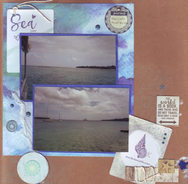
I decided to use the same sketch idea on this new layout.
I had some background paper with mottled blues,whites and a sea green. I matted my 2 photos in blue.
I found the remaining St Tropez range items in my stash (there isn't much) and used 2 of the journal cards on here. To add 3D interest I found torn gauze plus twine, using both in small amounts. I've also added some enamel dots.
Using bubble wrap, I softly inked on the background with cyan. I've layered that with painted chipboard and another circle sticker on the left and a quote on the right "The world is a book and those who do not travel read only a page."


No comments:
Post a Comment