and here is the layout that we asked to base our scraplift upon.It is based on one by Jen at http://livethemoment-jen.blogspot.com.au/2014/05/sketch-n-scrap-birthday-bash-scraplift.html


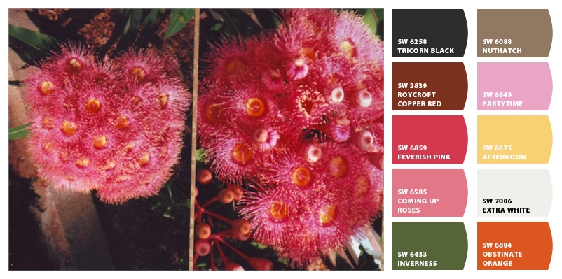
I've gone with the Inverness green and a neutral white and black for my corner strips.
My buttons are in the Feverish pink and the copper red (brown).
My title is in the rose pink. The 3 pearls are in co-ordinating colours too.
The only major difference I made on the layout was my title.
The alphas were too large to put on the left hand side.
I swapped the positioning of the journaling strips and the title.
I do not have one of the die cut machines to cut out letters like the one in the sample layout.
Here it is.

6 comments:
Stunning LO!
Love Love Love how your page turned out :) We seem to be doing the same challenges and nice to see the different versions of it :)
Great job with the challenge. I love the photo you chose for this layout.
A truly beautiful page and great tale on Jennifer's scraplift challenge. Thanks for joining in with us during Sketch N Scraps Birthday Bash. xx
Just beautiful! I love misting! Thanks for joining our birthday bash at Sketch N Scrap!
Such a beautiful page!! Love the colors and the misting! Thanks for playing along with my Sketch N Scrap birthday challenge!
Post a Comment